I’ve never liked the logo for the Philadelphia Weekly, with its crammed together capitals P and W. Whether it’s the two-color version (a bright yellow P slightly overlapping the black W), or the equally unimpressive single-color version (where the two letters bleed together), one thing is certain: I simply cannot stand that tiny little space at the top where the P meets the W. It looks poorly executed, or worse, accidental. Surely there is a better solution for a logo with those two letters. But, after a simple Google image search, it appears that there is not.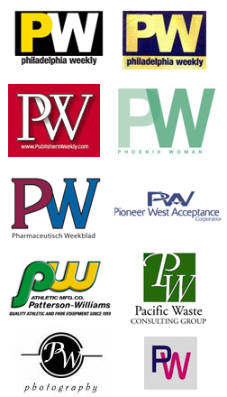
The letters P and W cannot be put together successfully in a single logo/word mark. It cannot be done. The only thing that can be done is to push the two letterforms together until they overlap or bleed into each other. Knowing this will save you valuable time when you are asked to design a logo for “Puppy World” or “Pancake Warehouse” or “Perry Winkle, Inc.” or…
UPDATE: Richard Felton has made me aware of a logo he worked on in the 80’s for “Price Waterhouse”, which shows that the PW letter combo can be done quite nicely:Thanks!